
There is something singular about a golf course logo.
Sure, there are lots of logos in the world—for sports teams, for fast food chains, for corporate businesses, etc.—but golf course logos are particularly awesome.
A great club logo can be simple or symbolic, intricate or timeless. Some places choose the ol’ standbys like interlocking letters but others go with animals, mythology or a region’s history.
I’m always fascinated by what a club chooses. Some of these logos have become so famous that they are instantly recognizable.
I thought it would be fun to put together a list of the top 10 golf course logos with a little explanation of why it slaps. Feel free to argue in the comments.
10. Whistling Straits (Sheboygan, Wisc.)
I’m a sucker for the Whistling Straits logo of a mythical wind god who looks to be, well, whistling.
Inspired by an 18th-century Irish Rococo carving found by former CEO Herb Kohler, the rugged character’s pursed lips and vast beard symbolize the windswept nature of the Wisconsin coastline.
You will see this as a theme on the list but I love when a club ties their logo together with the nature of the course.
Whistling Straits does it as well as any place.
9. Winged Foot (Mamaroneck, N.Y.)
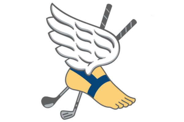
Come on, you have to love the Greek mythology-inspired logo of Winged Foot.
When the golf club was founded in 1921, its founders were primarily members of the prestigious New York Athletic Club. Because they wanted a physical location for their own golf course, they adopted the NYAC’s iconic “winged foot” seal—inspired by the winged sandals of the Greek god Hermes, which symbolize agility and the pursuit of excellence.
Rarely do you get a course logo that is on-the-nose and still so iconic.
8. Waterville (Ireland)
This isn’t the most recognizable one here—most of the great golf course logos reside in America—but I had to get the Waterville Irish hare logo on the list.
Irish hares are a common sight along the dunes and fairways of the seaside links so they make for a great symbol.
I typically am not a fan of the club’s founding year being involved in a logo but the way the hare is standing between the 1889 really does it for me. I also just love the hare’s look with his head turned. Excellent stuff.
7. Goat Hill Park (Oceanside, Calif.)
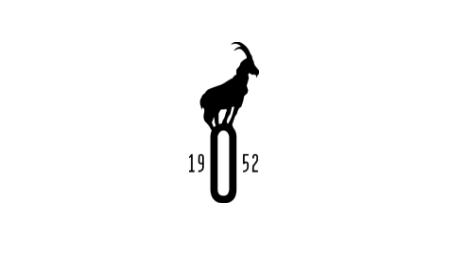
This might be a reach but I am obsessed with the Goat Hill Park logo.
Designed by Linksoul co-founder Geoffrey Cunningham, the goat stands on top of an “O” for Oceanside, Calif. The course was originally named Center City but came to be called Goat Hill as a joke because of deteriorating conditions but its official 2014 rebrand to Goat Hill Park is no joke.
The goat logo is both respectable as a legit course emblem and representative of the laid-back, anti-country club ethos vibe that is synonymous with Goat Hill.
No notes. This one was knocked out of the (Goat Hill) Park.
6. Wildwood (Portland, Ore.)
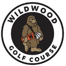
.
The Wildwood Golf Club logo was recently created as an ode to Bigfoot/Sasquatch, the Pacific Northwest legend.
“Locating Bigfoot seems like an elusive task, but the truth is Bigfoot has always been here,” the club’s website reads. “All this time, throughout our 30 years—just shape-shifting into many forms, but mostly playing golf—Bigfoot has called Wildwood home.
“Maybe you’ve seen glimpses of someone (or something), fluidly playing a cut on hole 10, just as the moon takes over. Maybe you’ve pured your shot and heard a faint “whoop” through the firs. Maybe you’ve noticed an unusually large footmark pressed into the worn-out range mat. “Is it or isn’t it?” you wonder, only to chunk the shot in confusion.”
I love everything about this. The logo. The design. The meaning behind it. They even named the logo after a man who helped build the course. Impeccable.
5. Pinehurst (Pinehurst, N.C.)
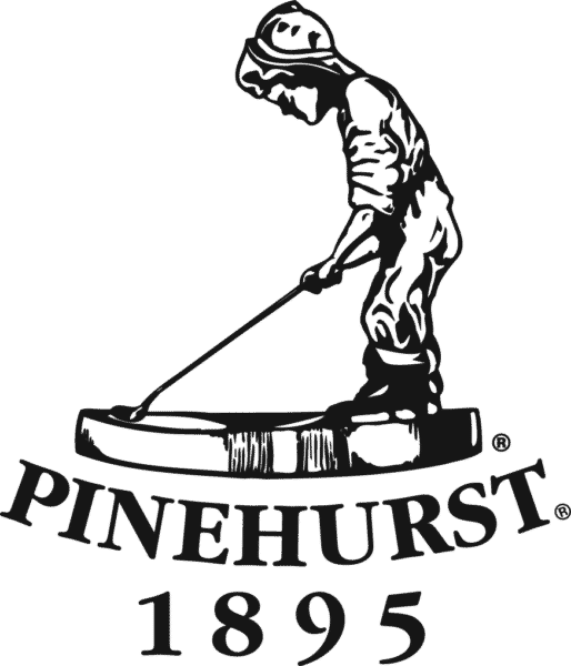
Putter Boy. You don’t even need to say anything else (although, of course, I will).
Pinehurst’s incredible logo dates back to advertising materials from the early 1900s and a subsequent statue built by Lucy Richards in 1912.
“The shaft of the club created the shadow that would be used on the sundial to tell time, and in order to get the proper angle, the length of the club had to be inordinately long,” according to the Pinehurst website.
This is so cool on multiple levels. The Putter Boy represents that youthful, pure enthusiasm for golf that we all share. Just pick up a club that is way too long and try to make it work.
The sundial element is sick. “Hey, how many more holes can we fit in? The Putter Boy says we can get in at least another nine.”
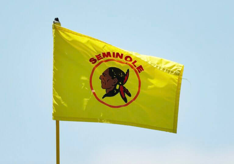
4. Seminole (Juno Beach, Fla.)

There is something to be said for a classic logo.
Seminole Golf Club’s logo features a stoic Seminole Native American with red feathers coming out of his hair. The gold circle around him and the choice of colors really pulls it all together.
When financier E.F. Hutton founded and built the club in 1929, he drew inspiration from the local Florida landscape, history and culture. The Seminole people of Florida proudly call themselves the “Unconquered People.”
The word “Seminole” also means “wild one” or “untamed”—fitting for the Donald Ross course that features ever-present winds and sandy areas.
3. Merion (Ardmore, Penn.)
Of all the timeless golf course logos, I think Merion’s wicker basket stick splitting the Scotch Broom bush is the best.
You have to consider how iconic the wicker basket is. Does any other course use something other than a flagstick? I’m sure someone does but Merion is so tied to the wicker basket.
I also have to say that the symmetry of this logo just screams golf tradition. It’s so aesthetically pleasing for reasons I can’t fully explain. You could see this on a polo from a mile away and know exactly what club it represents.
2. Pasatiempo (Santa Cruz, Calif.)
Nobody likes a good mid-afternoon siesta like yours truly. Pasatiempo’s logo really takes that concept to the next level.
Pasatiempo translates to “pastime,” “hobby” or “relaxed passage of time” in Spanish. So the logo of a person sitting under a tree relaxing under their sombrero is right on brand (and very relatable).
The logo also doubles as an embodiment of the laid-back leisurely vibe of a club.
You won’t be feeling as stress-free on Pasatiempo’s greens but I absolutely adore the concept of this logo.
1. Sleepy Hollow (Briarcliff Manor, N.Y.)
There are two parts of the Sleepy Hollow logo that really make this stand out for me.
One is the mythology. Washington Irving’s 1820 story The Legend of Sleepy Hollow talks about the Headless Horseman, a legendary supernatural figure dating back to the Middle Ages.
It makes for a perfect fit here.
Secondly, I just love the design. The angry horse, his mane flowing like fire. The Headless Horseman’s cape flowing in the wind. The color scheme. It all goes together perfectly.
What are your favorite golf course logos? Let me know below in the comments.


Frank Kelly
1 month ago
Eastward Ho!