
It’s hard not to love the Ryder Cup. This is golf’s one true rivalry—a biennial match that lasts only three days but endures in the memory of golf fans for decades.
There are so many aspects of this event that make it golf’s grandest spectacle. One of my favorites is the dynamic of team uniforms.
Modern-day pro golfers generally dress conservatively. Are there any stylish golfers out there? At least players like Jason Day and Tony Finau are willing to experiment but they are the outliers.
In the Ryder Cup, those conservative style choices historically been thrown out the door in favor of outfits that range from drippy to downright hideous. This event has an extensive history of great style, although it’s outnumbered by the train wrecks.
In this article, I’m going to take you through some of my favorite disasters. Because, honestly, who doesn’t love to make fun of a terrible golf outfit?
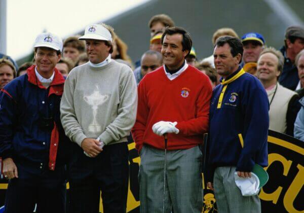
It’s interesting that most of the early Ryder Cup outfits were pretty classy. I couldn’t find much to make fun of, honestly.
Then things got weird from about 1985-2014, so all of the entries are from that period. If y’all find anything else, let me know in the comments.
In the last 10 years, the worst thing you can say is that the team uniforms have been on the uninspired side at times. There aren’t as many chances taken at this point. Teams have generally stuck with their traditional color scheme.
I’ve decided to omit victory photos where suits are involved—these are just golf attire outfits. Practice rounds are included.
10. 2010 U.S. Team
I will never forgive the 2010 U.S. team for coming out to Sunday singles dressed like Texas Tech.
Black shirt (with a red patch), black pants, black shoes, a red hat and red, white and blue belts. Yuck!
This was during an era where American teams strangely avoided the red, white and blue color combination. They eventually learned that you just have to play the hits and don’t overthink things.
9. 2014 Team Europe
Look, I don’t mind purple for the Europeans. It’s OK every now and then, preferably in practice rounds or maybe during Friday matches.
But this sweater/sweater vest that is like 55 percent dark purple and 45 percent light purple with a weird tattoo on the dark purple side is just hideous.
The Europeans were really into asymmetrical patterns at the time as a few of their 2014 uniforms matched that theme.
8. 1995 U.S. Team
The 1990s were tough for American golf fashion in the Ryder Cup (it gets worse than this).
It’s still uncertain why the 1995 team decided to pull out its picnic table linens for Sunday singles. I mean, maybe you wear these for a Tuesday practice round.
I’ll concede there is at least some red, white and blue in the uniform, an improvement on the 2010 debacle. But the pattern is egregious and the navy pants with black shoes aren’t helping.
7. 1993 U.S. Team
The Americans went with these strange beige trophy sweaters and then repeated the look a couple of decades later during the 2014 Ryder Cup (but using blue sweaters).
I just don’t fully understand the motive here. Why is the trophy so big? Why is there a trophy in the first place? And why is Europe wearing red while the Americans are wearing the most nondescript colors?
The Americans would win this Ryder Cup (the last time they won on European soil) and then wear beige suits on top of the beige sweaters. Woof.
6. 2012 Team Europe

This is not the Tour de France.
Rarely does one color choice immediately qualify a uniform to be a disaster but this highlighter lime polo the Europeans wore in 2012 is hard to get behind.
What makes it even tougher is that you have “Team Europe” written in a weird spot on the front, while a few random black lines on the shoulder, sleeve and collar round out a very awkward look.
5. 1989 U.S. Team
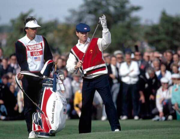
I can kind of see what they were going for considering the era when this uniform came out (late ’80s). It was definitely a time where this sort of look fit right in with everyone else.
But such a busy cardigan over a white collared shirt is just not an ideal combo in my book.
We’ve got the right color scheme and I like the navy pants with the white shoes. Still, the cardigan is more of a cream on the sleeves and there is so much going on with red, gray, blue and cream all involved.
This is a fit they don’t have to bring back.
4. 2008 Team Europe
This whole outfit is so 2000 and late (shoutout Black Eyed Peas).
White hat, white pants—and then choose your own adventure on the belts and shoes.
But the real star of the show is this blue shirt that looks like Temu J.Lindeberg.
We’ve got an electric blue with a weird stripe across the collarbone. For some reason, there are a bunch of stripes on the back. Throw in a white collar just to tie it all together.
I understand there are others on this list that are technically worse, but I’m irrationally angry at this one.
I’m also using this as a catch-all for some truly awful color choices the Europeans made during this era. We had the aforementioned lime green but there was also orange and all sorts of strange colors going on.
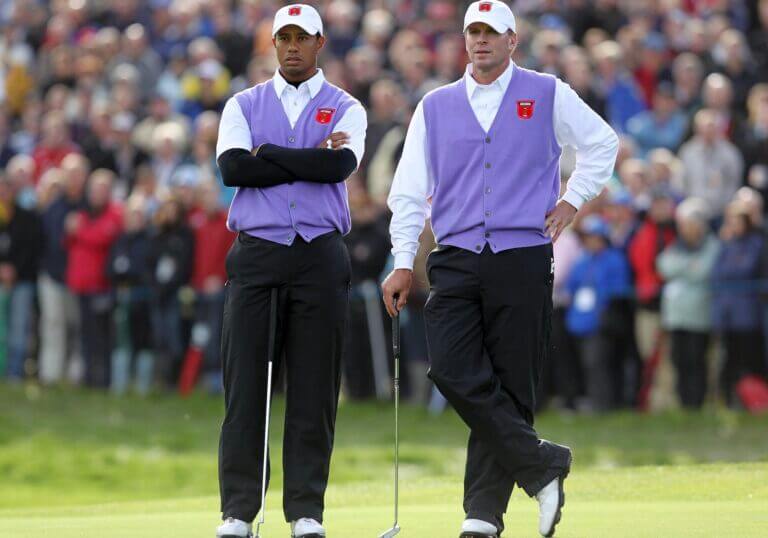
3. 2010 U.S. Team
Yes, the 2010 team is on here twice. There is even a third 2010 uniform that was a nominee.
There are some people who love this look with the lavender sweater vests. I am not one of those people.
First of all, the red patch on the vest and the hat just doesn’t mesh well here.
Secondly, it just looks like they are waiters (ordering up another U.S. shellacking).
Thirdly, I’m against the U.S. going with purple uniforms. They look like the GB&I team in the Walker Cup.
2. 2006 U.S. Team
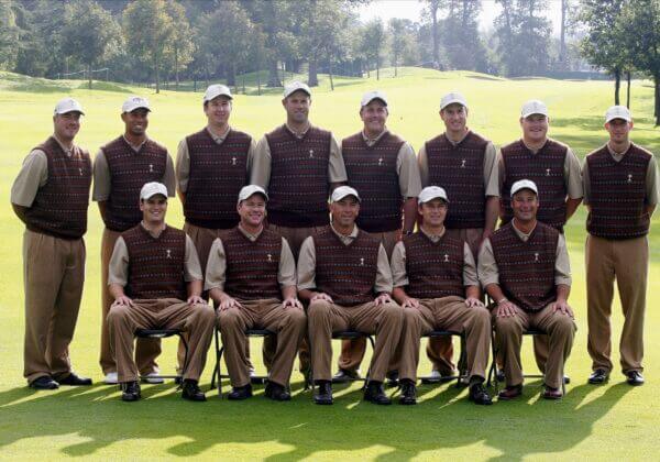
What can brown do for you?
For the 2006 U.S. Ryder Cup team, apparently brown could do everything. These practice round uniforms feature brown on brown on brown on brown. It might be an homage to the 2002 European team who pulled off a similar look (let’s just consider them a part of this selection).
I’m kind of obsessed with this team. Did you know Brett Wetterich, Vaughn Taylor, J.J. Henry, Scott Verplank and Chad Campbell were on this team? Now you do.
Tiger and Phil had to take on the Europeans with an assorted group of plumbers and firemen.
1. 1999 U.S. Team
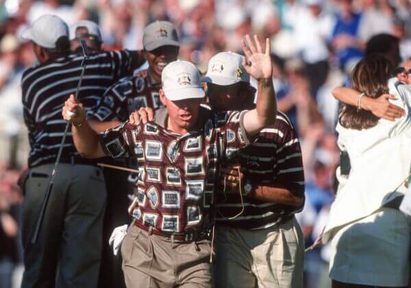
The gold standard for terrible Ryder Cup outfits, this shirt the U.S. team wore during its epic comeback on Sunday to win the 1999 Ryder Cup is truly abhorrent.
I would argue that the shirt—which features team pictures of past American squads—is so bad that it’s actually good.
The disgusting maroon color, paired with black-and-white framed photos and a beige collar, “matches” the baggy khaki pants, brown belt and white hat (none of these colors is even remotely close to red, white and blue).
It’s possible a group of golfers has never looked this awful and I’ve been to some member-guests where regrettable choices were made.
Is this the worst Ryder Cup uniform in history? What would you put at No. 1?
Let me know below in the comments.


Vince
9 months ago
I would demand my money back of a collar like that! Totally embarrasing rubbish. Better from Temu!!